dotCMS is the content management system used by SUNY Cortland to manage the cortland.edu website. This guide is supplied as a reference for common functions and workflows in dotCMS.
Important Links and Resources
Creating New Pages and Content
Creating a New Page
- Browse to the folder in dotCMS that will contain the new page.
- Use the Add New button at the top right of the screen, then select Page.
- A pop-up window will ask if you want to create a page asset. Use the Select button to continue.
- Give the page a meaningful title. This will be used as the main heading for the page.
- Confirm that Host or Folder matches the folder used in step 1. If not, select the correct folder.
- If desired, enable Show on Menu. This will add the page to the menu for all related content. Use the Sort Order number to set where the link will be placed in the menu.
- For a normal page, set the Template to cortland.edu RWD – 1 Main (12), subnav.
Tip: when selecting the template, typing RWD into the template selection box will filter the list to only the current template choices. - Save the page when finished. If you choose Save and Publish, the blank page you just created will be published immediately. This may not be a problem if you are ready to complete the page now.
Creating New Content
- Using the site browser in dotCMS, open the page that will contain the new content and lock the page for editing.
- Use the Add Content button above the section where you want to add the new content, and select New Content. The main content area has two Add Content buttons. The top button should only be used for images in a rotating carousel.
- Enter a title that identifies the content. This title will not be visible on the page, but can be useful when searching in dotCMS. For example, "Marketing Office: Contact Us" is more specific than "Contact Us."
- Set the Host field to the same folder as the page that will contain the content.
- Add your information to the Body. View the dotCMS Editor reference below for a description of commonly used features.
- Save / Publish when the content is finished.
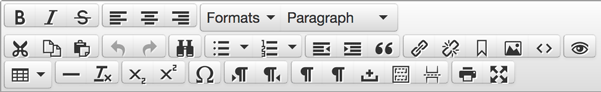
The dotCMS Editor
The content editor in dotCMS contains many of the same editing functions of a word processor. This section highlights the most common functions of the editor toolbar, pictured below.
Bold
Use Bold sparingly to indicate important text.
Italic
Use Italic sparingly to indicate important text that should be read with emphasis.
Little Header Format
Use Header > Little Header to reduce the font size of a heading to the normal paragraph font size.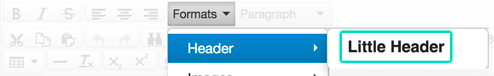
Screen Reader Only Format
Use Links > Screen Reader Only to include text that is accessible to screen readers but not shown on screen. This can be used to enhance link text like “Read More” that does not describe where the link goes.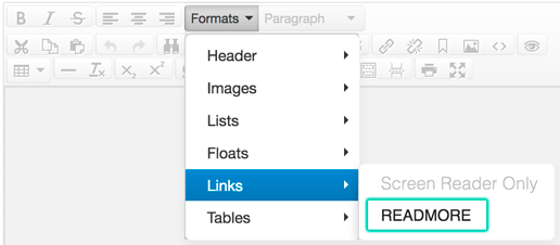
Headings
Use h2 through h6 to indicate headings.
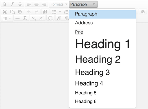
The h1 heading is used for the title of the page, which is included automatically on a SUNY Cortland webpage. Subsequent headings define the structure of the page. Examples of proper heading structure are provided on Mozilla Developer's Network website.
Images
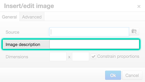
Use the Insert/edit image option to manage the source and image description for an image.
The image description should include concise, meaningful information that is provided to screen readers in place of the image. For more information, view the visit the Images in dotCMS section below, and view Webaim's Alternative Text article.
Clear Formatting
Select the text/content in the editor that you'd like to reformat, then use the clear formatting button. This step should always be taken after pasting content from an outside source such as a Microsoft Word document.
Images in dotCMS
Image Formats and File Sizes
When saving images for the web, the image format and compression will vary depending on the image.
Graphics
Graphics and simple images with few colors should be saved as a PNG.
Photographs
Photographs and full-color images should be saved using the JPEG format (sometimes labeled as JPG). When exporting an image from Adobe Photoshop, the Quality setting for a JPEG should be set between 50 and 60 percent, depending on the clarity needed. A banner image (850 by 400 pixels) should not exceed 100 kilobytes (kB) in size.
The following video describes the process of resizing an image and saving/compressing it for the web.
Image Descriptions
When inserting an image in dotCMS, include a description. The image description should include concise, meaningful information that is provided to screen readers in place of the image.
The description should include all important or meaningful information in the image. Consider the purpose of the image on the page; how is it relevant and what is it conveying? If the image was not shown, what would you need to know about it?
Image Dimensions
When creating images to use on your website, choosing the correct format and size is important.
Banner Images and Images In Body Content
Images in single-column body content should be no larger than 850 pixels wide, and only as tall as needed. Banner images should be sized to 850 pixels wide and 400 pixels high.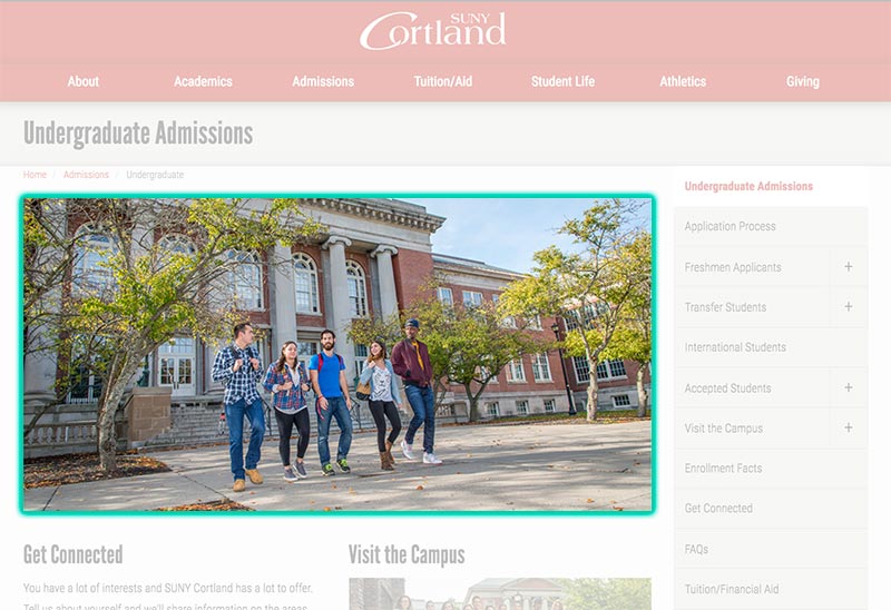
Profile images or Images In the Right Navigation Column
Images in the right column should be 300 pixels wide or less, and only as tall as needed.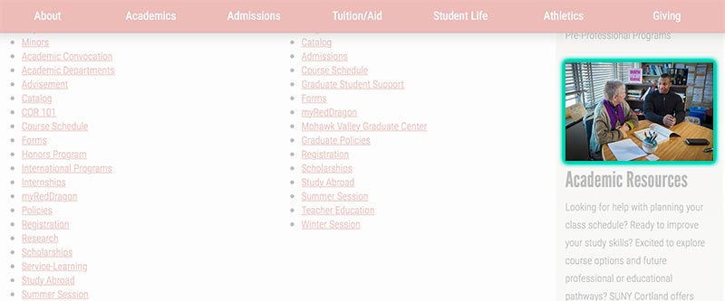
Two-Column Body Content
When body content is split into two equal-width columns, images should be 600 pixels wide or less, and only as tall as needed.