Alfred University
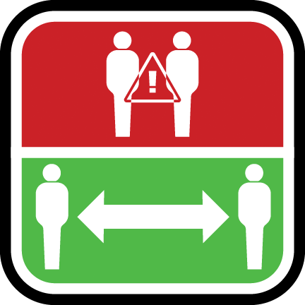
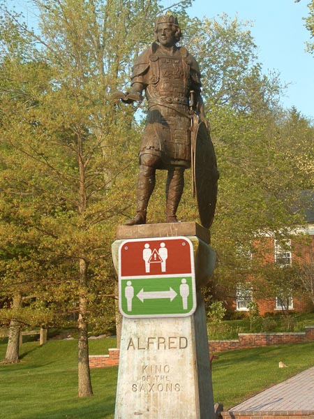
Ben Yelich | Sophomore | ART 213 Integrative Graphic Design | Alfred University
My design is a way to show that physical distance is the best for our safety in our society today.
Chloe Chen | Sophomore | ART 213 Integrative Graphic Design | Alfred University
Flags have historically been used to boost morale, to symbolize troops and convey messages. This coincides with my idea of sword and shield. It's like a silent cry, telling every student on campus that they are the most courageous warriors fighting COVID.

Emily Sierzant | Sophomore | ART 213 Integrative Graphic Design | Alfred University
Despite the world's wide array of different people, cultures, and places, there is one common threat that unites us all: COVID-19. My piece promotes the theme of unity though the symbol’s main figure, which is composed of a single line, showing how we all must work together to wear a mask and 'flatten the curve' for COVID-19. The shape of my symbol also resembles a human’s face, letting the viewer know that we cannot beat COVID-19 without them. If the world wants to beat COVID-19, we will all certainly have to wear a mask.
Harrison Atwater | Sophomore | ART 213 Integrative Graphic Design | Alfred University
I wanted to come up with something that portrayed a warning in a very simple and straightforward way. My first thought was the warning sign—the simple yellow triangle with an exclamation point. It’s universally known and easily reads “warning” or "caution.”
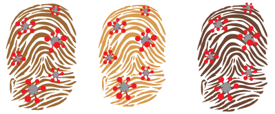
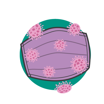
Liz Radigan | Sophomore | ART 213 Integrative Graphic Design | Alfred University
The design is meant to be put on to high touch surfaces to remind people of another way the virus can be spread. Additionally, the design can be used to remind people to sanitize objects and our hands. The fingerprints are various flesh tones and colors to be all inclusive and remind everyone that the whole world is being affected.
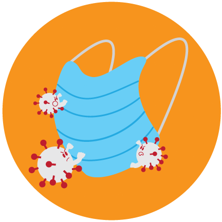
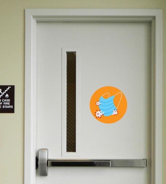
Molly Fox | Sophomore | ART 213 Integrative Graphic Design | Alfred University
My design promotes wearing a mask to protect against the coronavirus. In context, the design would be displayed as a large sticker on entry and exit points in buildings placed eye level on the door.
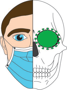
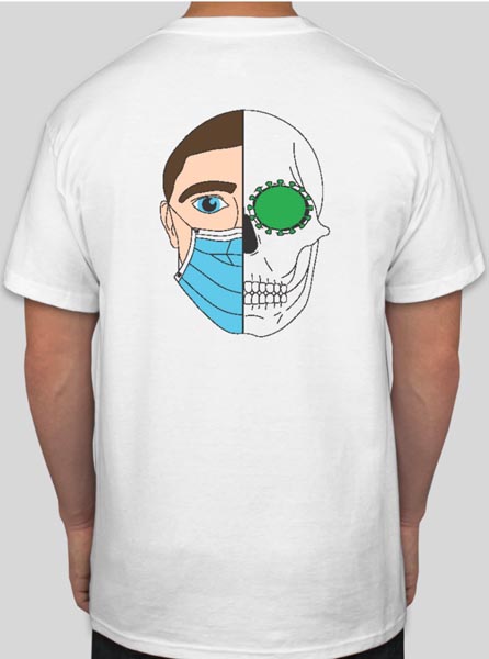
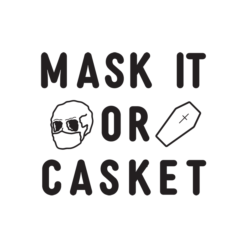
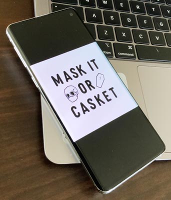
Sean Laukaitis | Sophomore | ART 213 Integrative Graphic Design | Alfred University
The comparison between the skull and the person with a mask is used to show the extremes and to portray the high level of precaution that needs to be taken during the times we are in.
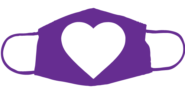
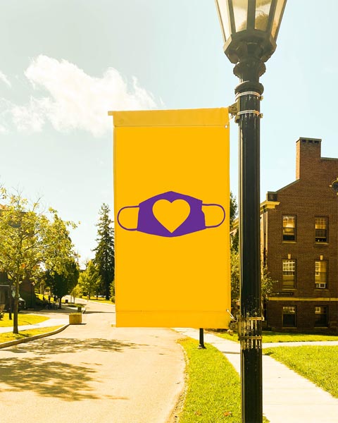
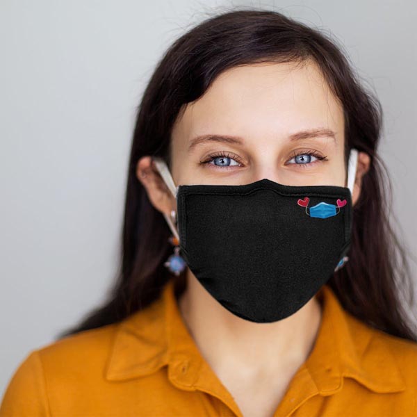
Trey Millward | Sophomore | ART 213 Integrative Graphic Design | Alfred University
For my design I wanted to create an image that promoted wearing a mask, and yet, embodied all of the safety precautions in one image. I chose to go with the mask alone, rather than integrate hand-washing, or social distancing because there is a large demographic in the U.S. that are resistant to mask-wearing, almost as if “anti-mask” is a movement or a statement. I don’t feel like people feel the same resistance to say, washing their hands. The mask has become the overarching symbol of cautiousness in regard to Covid-19.
So, I created a design that has a positive connotation. In order to appeal to college students, I integrated the “like” button (the heart) from the social media application TikTok. At this point in the pandemic, we are all aware of the risks. Creating positive, recognizable imagery that reinforces a kind of “we’re in this together” mentality is the best way to promote safety throughout this pandemic.
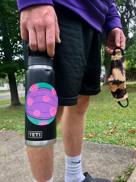
Paige Castleman | Sophomore | ART 213 Integrative Graphic Design
This is a sticker I have created for reusable water bottles that serves, all day, as a reminder to wear a mask.
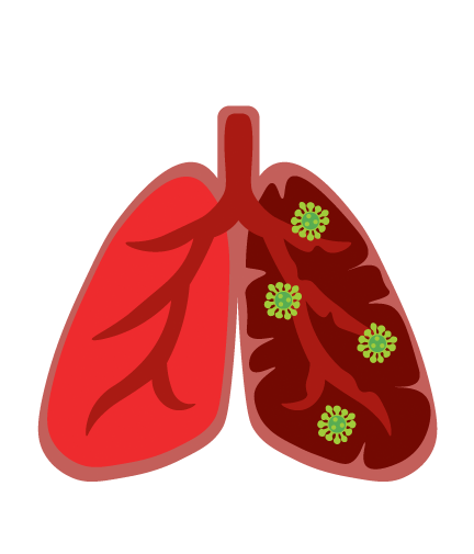
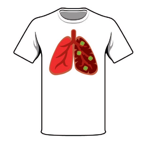
Bobby Hall | Junior | ART 300 Integrative Web Design | Alfred University
The comparison of the healthy and infected lung represents the risks involved if we are not 100% on board with COVID-19 safety precautions.
Ting Germain | Senior | ART 401 Senior Studio | Alfred University
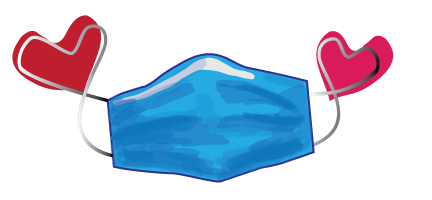
Wearing a mask is an act of kindness. I think the heart is important imagery to the word of caring and kindness. The hearts on either end show distance by being separated by the main mask part, and kindness with the heart shape.
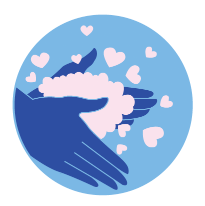
Paige Wetherwax | Senior | ART 401 Senior Studio | Alfred University
The use of universal symbols in this sticker design provides a quick and easily understood reminder to wash our hands. Hearts, the universal symbol of love, replace soap bubbles to remind us that frequent hand washing is not only an act of care and love for ourselves, but to those around us as well. This sticker would be especially compelling on restroom soap dispensers, mirrors, paper towel dispensers and hand sanitizing stations.
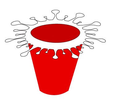
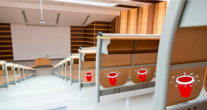
Carrie Dugan | Senior | ART 300 Integrative Web Design | Alfred University
As many students have returned to college, there is a temptation to participate in activities of the past, such as partying. I used the imagery of a red solo cup and the COVID-19 spikes to warn of the danger of infection from attending college parties.
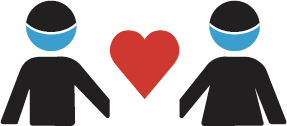
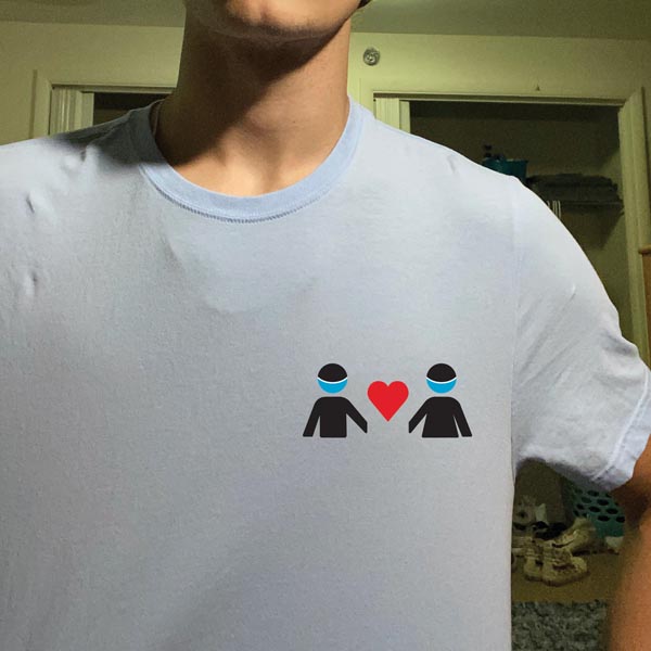
Joe Brady | Sophomore | ART 213 Integrative Graphic Design | Alfred University
This design is heavily inspired and constructed by solely shapes and color. The center heart was a last second addition, but I think it helps create a positive message instead of a dreadful one while also being satisfying to look at. The main idea behind this design is that the two figures are together in unity and are cooperating in this time of need which is why they look like they are holding hands. But the space between their hands is meant to stand out because they have to maintain social distancing. The goal was to get people to notice that they look like they're holding hands but when they focus on it they realize that they are not, sending the message that they're in this together even though they are separated.
SUNY Brockport
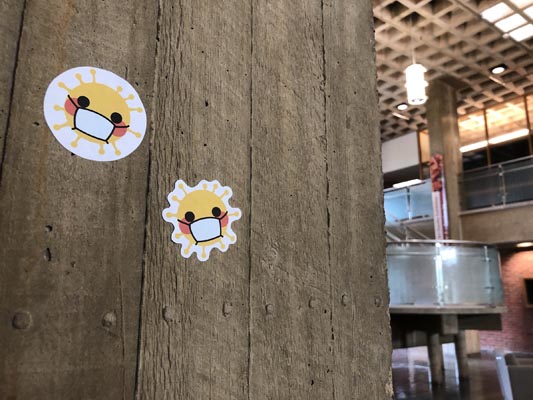
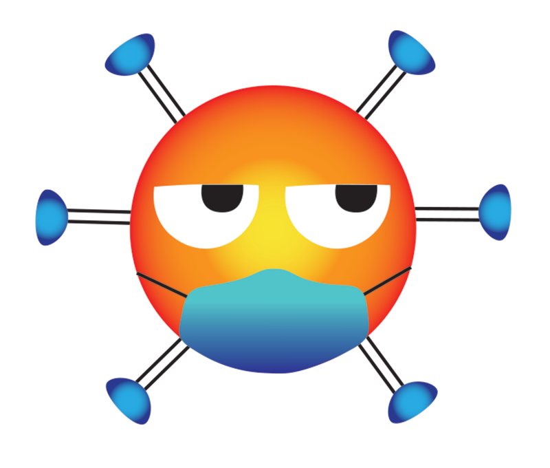
Jessica Barraco | SUNY Brockport
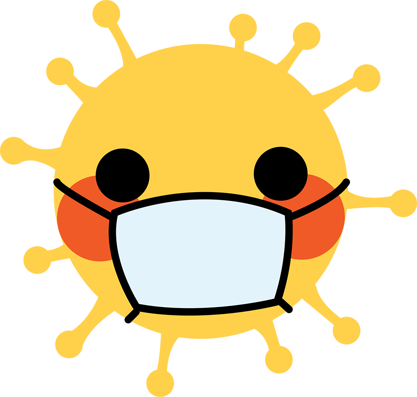
For the campus COVID-19 safety campaign, I decided to create an icon that resembled the familiar emoji. I believe that this is successful for my audience of college students since the majority of them recognize and use emojis. I went with yellow as that is the default emoji face color, with red cheeks to make it livelier. The emoji is stylized in my own way, so it does not copy the exact emoji structure. Instead of having the regular round shape of the head, I added rounded spikes around the circle to make it resemble the structure of the coronavirus. A mask is covering the mouth of the emoji to represent the importance of wearing a mask. This design is both playful and successful in convincing others to follow guidelines by wearing a mask or some sort of face covering. I implemented this design by creating stickers of it. It can both be cut as a perfect circle or cut to follow the contour of the design. My example shows the stickers placed on a pillar in the Tower Fine Arts building at SUNY Brockport. Although I represented my design through a sticker, it can also be used as a graphic on a t-shirt, hat, poster, and many other implementations. This was a fun project to work on and I am happy with the solution I created.
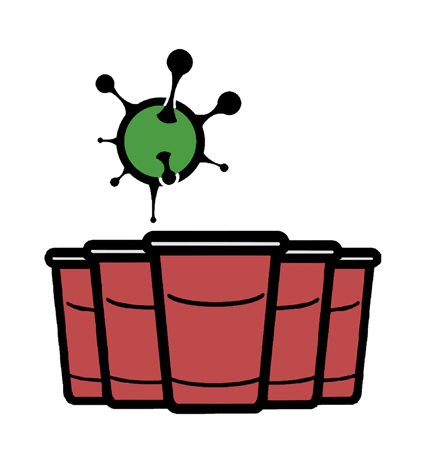
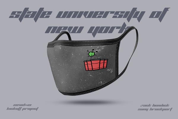
Zachery Bendick | SUNY Brockport
My design sends a message directly to students. Beer pong is the first thing I think of when it comes to college nightlife. I created an original design of beer pong cups, and a virus ball to represent the beer pong ball. I drew inspiration from Simon Oxley (designed Twitter's icon) and his simplistic forms. I then put this design on a mask as that is the new normal in the days of a pandemic. Everyone has a mask and it is right on the wearers face so the design will always be noticed.

Takara Brundidge | SUNY Brockport
For my Covid 19 project I decided to incorporate “The VOUGE Challenge.” Which was very popular on Instagram during this phase. Hence, my typography selection I wanted my project to not only promote the safety aspect of COVID but also provide students with fashionable wear. I believe if an item is popular the majority will follow the “trend.” The suds in my first design represents washing your hands properly and frequently while my color choice represents the required masks we wear. I decided to create a second graphic to give students a variety of fashion choice. I wanted to treat this project as if I was really creating a fashion line to sell. The second graphic is a more sleek and simpler look. It keeps the same consistency as the first graphic. Presented in the behind the typography is a graphic suggestive of both bubbles and the biohazard graphic to give that extra push that COVID should be taken seriously.
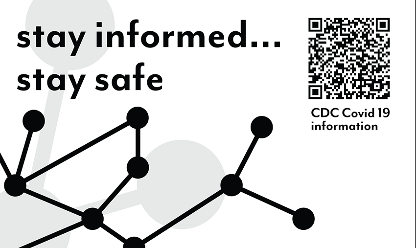
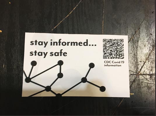
Matthew Colucci | SUNY Brockport
My message for my project was “stay informed… stay safe.” I picked this because the lack of information and the spread of misinformation has led to many of the safety issues we see today. The dots and lines are meant to represent people connecting the dots and putting information together. I included a QR code for the CDC’s website to direct people to quality information. My design is meant to be a sticker so people can put the code up wherever.
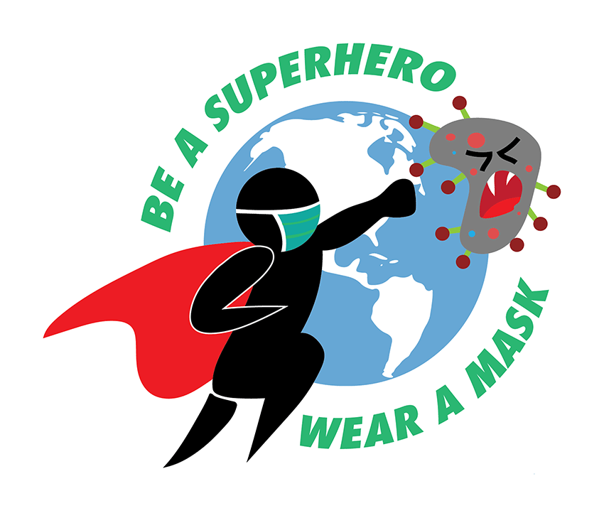
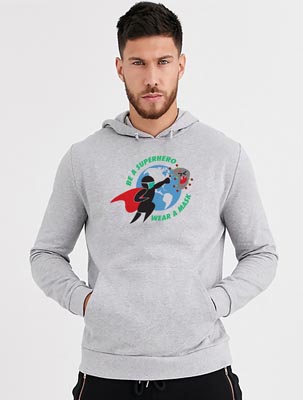
Alexander Hilderbrandt | SUNY Brockport
For my project, I tried to pick a topic that could be of interest to many people, to help express the world-wide concern of the Corona Virus. I came up with the concept of a superhero defeating a cartoon like Corona virus. The reason why I decided to go with a superhero, is because superhero’s usually wear masks and we as humans view them as invincible or strong enough to defeat anything. We look up to these fiction characters and want to do and be just like them, thus creating a connection with the viewer. For my project I decided to create a superhero wearing a mask who is trying to rid the world of corona virus, as he punches the virus out of the earth. The colors I made the cartoon COVID-19 is the same colors as the actual virus, making the cartoon virus have even more realistic. The Font and type style that I used was more of a cartoony bold font to help bring together the whole message. My design was built to be primarily used for a T-shirt, Car decal, and for a sticker.
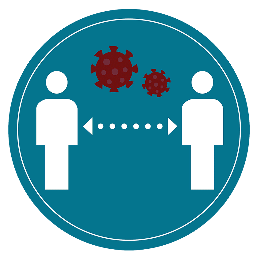
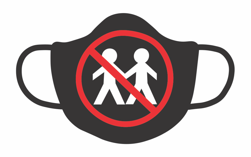
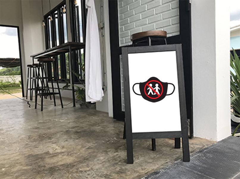
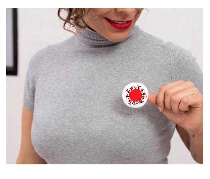
Indira Marte | SUNY Brockport
This button design helps to promote students to social distance which is recommended by the CDC. When the campus hosts an event, this graphic helps support Coronavirus safety. I designed my graphic for use on buttons that students can wear on their shirt or jacket. I signaled social distancing with two people in my graphic. The six dots represent 6 feet of distance between one another whenever possible. I made a shape of the Coronavirus on the top center between the two people. The Coronavirus is dangerous, and we need to help limit the spread among people.
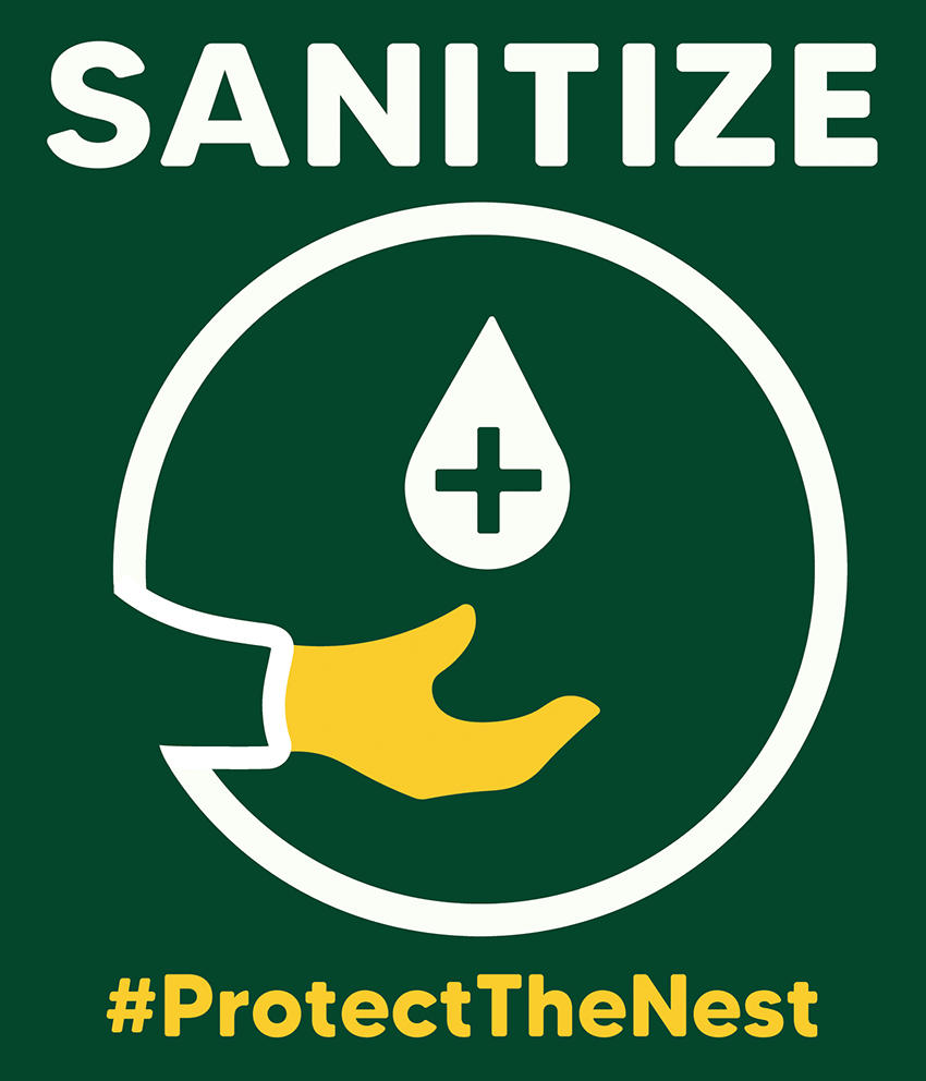
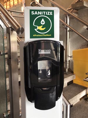
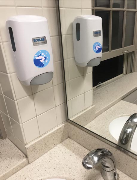
Alecia Proctor | SUNY Brockport
One of the first things I noticed when in-person classes started up again was all of the sanitize stations set up within the building. Wipes are available in each classroom for our workspace and a hand sanitizer dispenser can be found by each door. However, while each classroom station had a little sign about using the wipes, the dispensers by the door had nothing. For this project, I decided to make an eye-catching sign to make the station stand out and send a positive message. Our school’s (SUNY Brockport) message in regard to COVID-19 is “protect the nest” since our mascot is an eagle and we are protecting our home and each other. I took this hashtag and combined it with a simple little hand sanitize icon and the word “sanitize.” Short and sweet as well as eye catching. Not to mention in the college’s colors! This design is simple enough where it could be adapted to other schools as well.
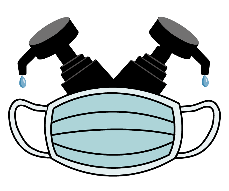
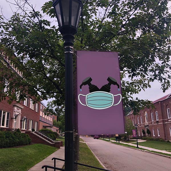
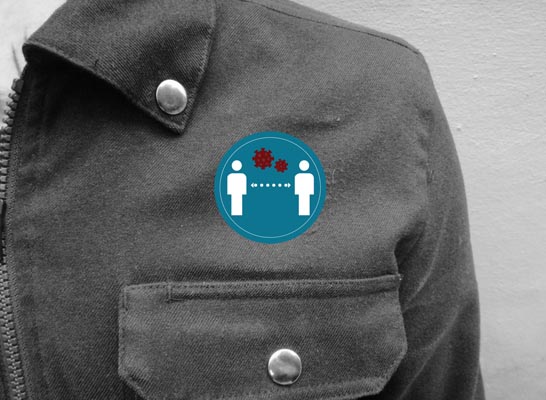
Daniel Stone | SUNY Brockport
This design is very adaptable in its use. I created it with the intention for use on buttons, stickers, or apparel, but it also adapts well to simply being an image flashed on a phone screen. I chose to keep it relatively simple as it’s an easy message to understand. I also chose this style because it’s in a similar vein to something my friends would actually own yet could also appeal to people outside of this demographic. The choice to place the icons on either side of the text was done so the message was displayed twice in the piece.
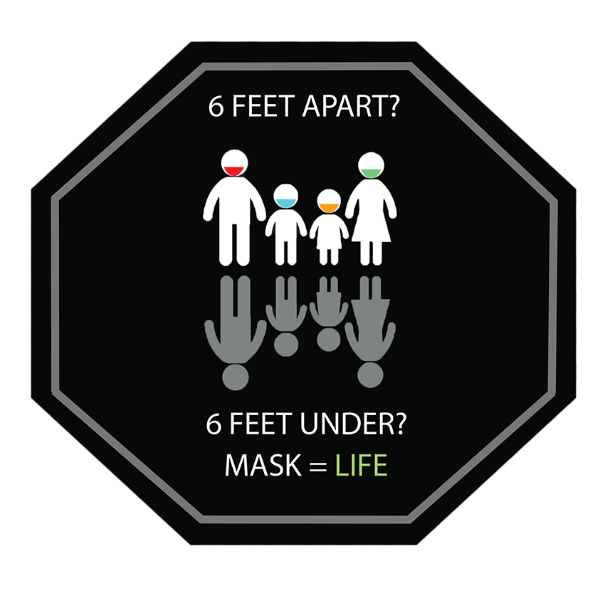
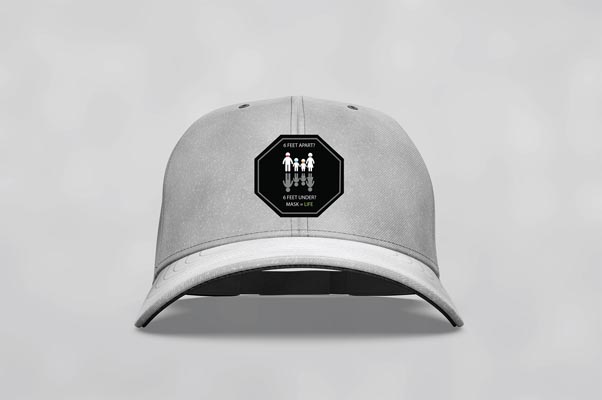
Leilani Ward | SUNY Brockport
I began with an octagon shape because I knew viewers would associate it with a stop sign, and therefore catch their attention. I decided on black because it is both bold and warning color when paired with the correct message. I chose the white icons in contrast to the gray “reflection” to illustrate what could happen if one does not wear a mask and socially distance. I think the final result is blunt and visually effective.
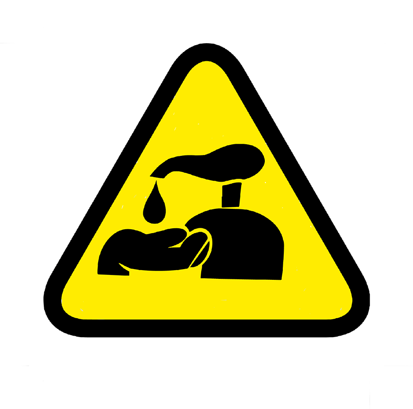
Jonathan Simms | SUNY Brockport
I created this design as a way to reinforce that people should be washing and sanitizing their hands. I decided to use the black and yellow caution colors and the shape to grab attention. I put the sign on a wall because I created it as a sign that you would see when walking around campus. When students walk to class, they can see this sign and it will remind them to wash their hands and sanitize, and also it will remind them how serious this illness is.
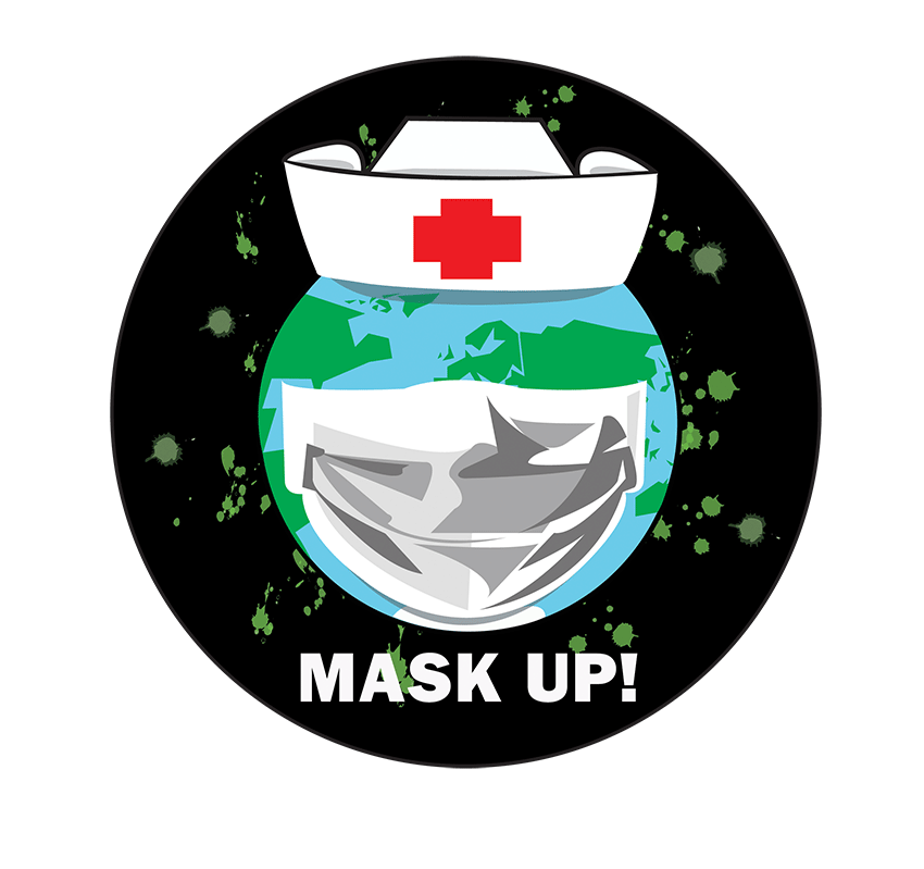
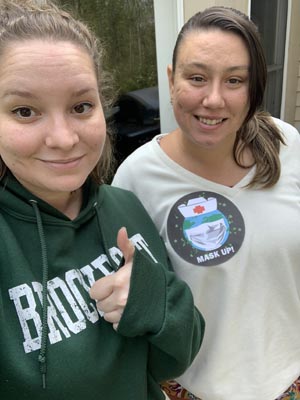
Rachael Wehner | SUNY Brockport
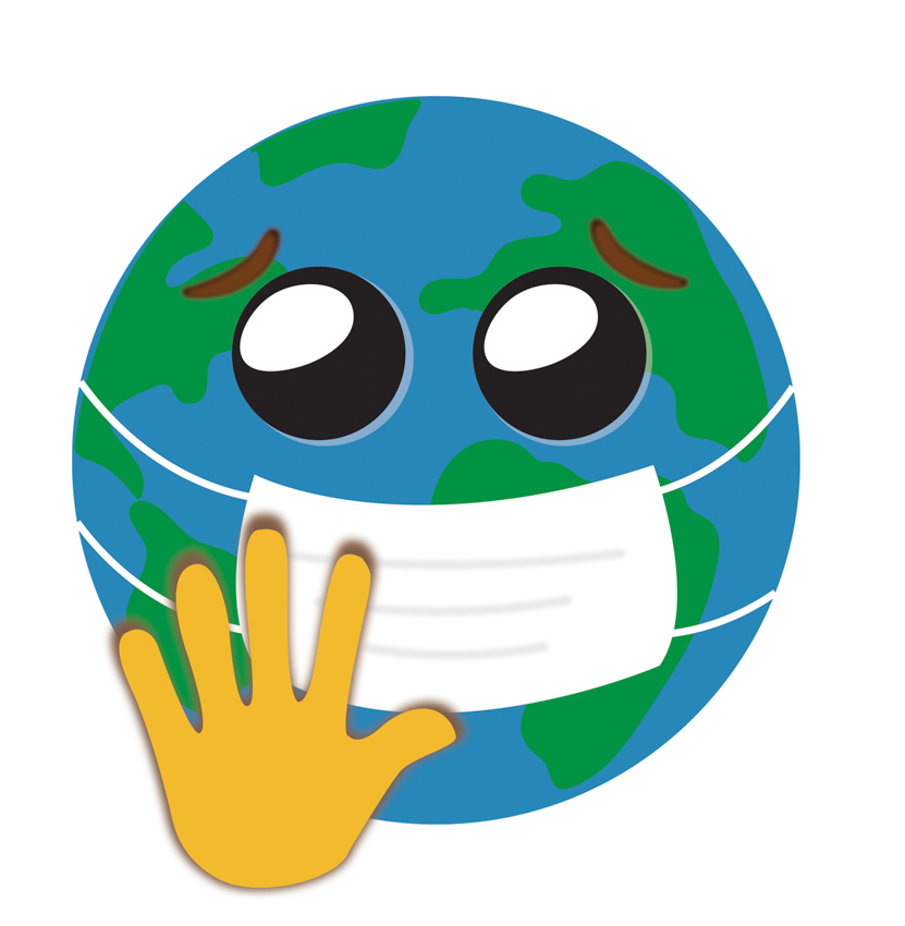
The “Mask Up!” graphic is intended to remind people to wear their masks while in public areas or around large groups of people. The icon for this logo is the Earth wearing a facemask and an old-school nurse’s hat. The nurse’s hat is to help people feel sense a trust while looking at the logo; after all, nurses are people we put our entire trust into to help us with our health. The continents making up the green parts of the Earth, are simple and geometric, so the viewers won’t get distracted by them, and yet, are still true to the actual shapes of the continents making up the Earth’s surface. The facemask has the same geometric characteristics as the continents, making the shadows and folds of the mask. This helps to unify the overall illustrative look of the graphic, making it aesthetically pleasing to view. The Earth is surrounded by small, green circular shapes meant to represent germs trying to get into the Earth. However, they can’t enter or contaminate anyone due to the Earth wearing its facemask. This is meant to show how wearing a facemask can help prevent the spread of germs. Lastly, the slogan of the graphic is “Mask Up!”, this is simple and to the point. It is also a play-off of the saying “Suit Up!”, which people find catchy and easy to remember.
SUNY Cortland
Leah Bernhardt | Graphic Design I - ATS 240 001 | SUNY Cortland
This design is an emoji of the COVID-19 virus. It was created in illustrator using the various tools on the program. The purpose of this design is to inform people about wearing a mark and to social distance.
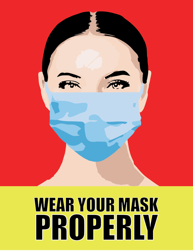
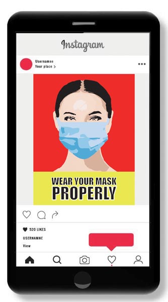
Shannon Delaney | Graphic Design I - ATS 240 001 | SUNY Cortland
I decided to create “Wear a Mask Properly” after continuous frustration seeing people wearing their masks improperly. I took inspiration from the realistic color blocking techniques used commonly in political advertisements. I was immediately entranced by the eyes of the model I used as a reference. They don’t show a distinct emotion but stare into the viewer, which I deemed important as most of the face is covered. Due to this, I believe I achieved a caring, yet forceful emotion conveyed by the subject in my project.
Gabriella Grieser | Graphic Design I - ATS 240 001 | SUNY Cortland
I created this emoji to show how the whole world is in this together and everyone has to work together to stop the spread of the coronavirus. This emoji shows a hand up and a mask to symbolize that everyone needs to stop and wear a mask to prevent the spread. The emoji has sad eyes because it shows how everyone is feeling throughout this, everyone feels sad and alone during these hard times. During the pandemic, the whole world was affected and now the world needs a restart.
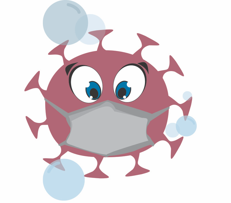
Katherine Kresser | Graphic Design I - ATS 240 001 | SUNY Cortland
This is an emoji representing the Covid molecule itself, at risk. Surrounded by the factors used to kill off Covid (such as a face mask and soap suds), the molecule is looking nervous and is sweating as it is getting killed off.
Cassidy Light | Graphic Design I - ATS 240 001 | SUNY Cortland
Social distancing and mask are required to keep safe and healthy
Sarah-Renee McNeal | Graphic Design I - ATS 240 001 | SUNY Cortland
This symbol encourages people to stay connected during social distancing. Covid-19 effects everyone, and only together we can beat this pandemic.
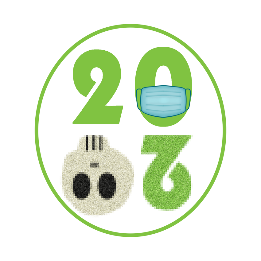

Holly Taylor | Graphic Design I - ATS 240 001 | SUNY Cortland
This design is to remember 2020, the year of the Pandemic.
SUNY Purchase
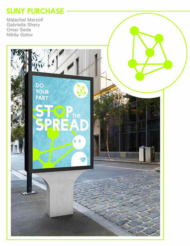
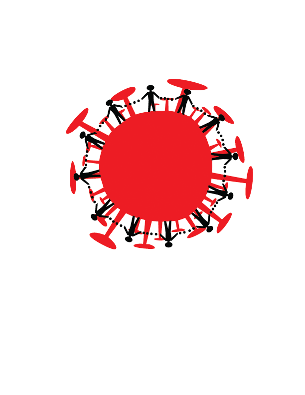
Malachai Marzolf, Gabriella Shery, Omar Seda, Nikita Gotov | SUNY Purchase
As COVID-19 continues to spread, our team wants to bring awareness and a sense of community in these struggling times. Through our logo of the green nodes, we reflect the concept of the spread of COVID-19, calling all hands to stop the spread. Also through this logo and the use of the symbol in the composition, our team encourages connection in a time that feels extremely isolating. It takes a village to stop this spread, and our team wants to fuel the community effort it will take and that we are all in this together. Together we can stop the spread and keep our communities safe.
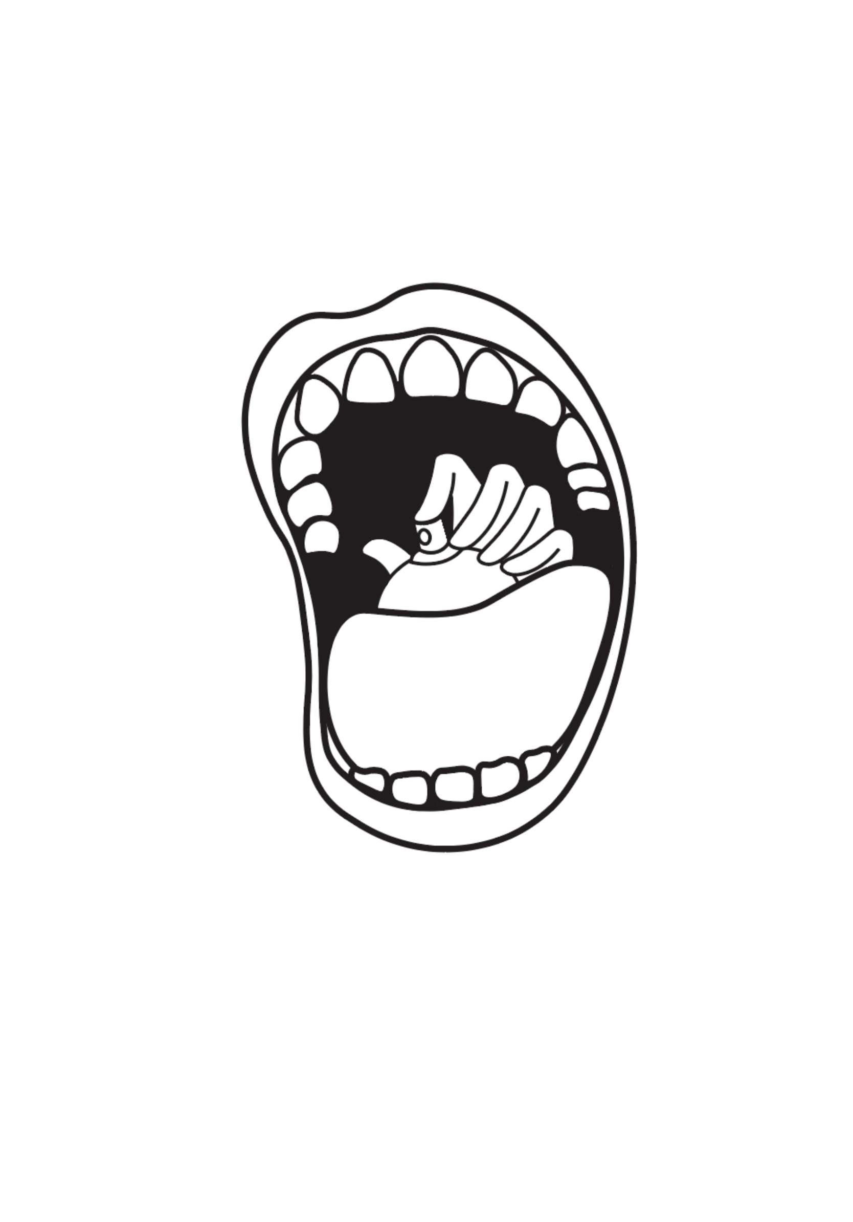
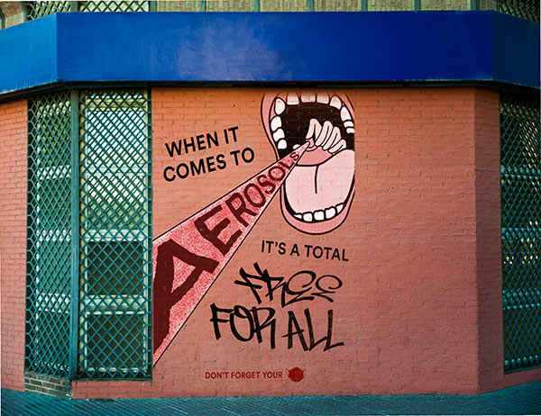
Jason Doherty, Jasmine Everett, Jordan Huynh, Bonnie Powers, Daniel Tavares Zlock | SUNY Purchase
The importance of mask wearing is exemplified through the comparison to aerosol spray cans. The general population recognizes that aerosol sprays are hazardous and uses masks when working with them. By using this analogy, we hope to inspire others to wear masks so as to prevent “spraying” their germs at others while also keeping themselves safe from these hazardous germs.


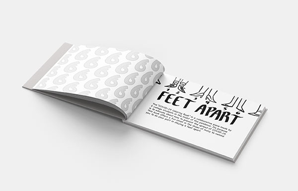
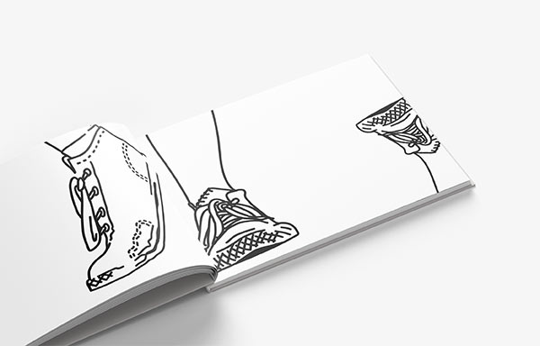
Kaspar Horsfield, Stella Picuri, Catherine Fabrizio, Regina McClain, and Basil Molina | SUNY Purchase
The “COVID-19 Coloring Book” is a collaborative piece made by five college students in the midst of the pandemic. Its purpose is to educate about how to prevent the spread of COVID-19. This book offers a fun stroll in the shoes of many to remind you to do your part in staying six feet apart.